Allen Crawford: on designing the art for Spiral Down and Vibrate, Melt Away Too Soon & Ultraviolet
Rob and I have been friends since our early days in high school, and although we don't see each other as much as we used to, I still think of him more as a brother than a friend.
In the late 80's and early 90's, I was a young, ambitious graphic designer who had just graduated from the local state college, where most of our circle of friends attended. Marooned in South Jersey and frustrated by the tacky casino advertising and collateral I had to design for the podunk agency I worked for, I was desperate for exciting projects. Rob founded Deardarkhead and in many ways was its de facto leader, and so it followed that he was also the one who was most involved in the visual presentation of the band, namely its promo packets, flyers, and cd packaging.
Rob and I spent many evenings in my agency's studio (often without my boss knowing I was there), xeroxing images and pasting up fliers. When we weren't there, we'd be at his house, shooting color slides of 4AD-inspired miniature tableaus consisting of colored lights, colored cellophane, aluminum foil, and dead sealife. It was no accident that we gravitated towards oceanic imagery: having grown up near a bay in Southern New Jersey, both Rob and I regarded the sea with a kind of boyish curiosity. It was the vast mystery lapping at our doorstep. It might be why we responded to the shoegaze sound in the first place: epic, oceanic swirls of guitars probably wouldn't have resonated so strongly with us had we lived in, say, Indiana.
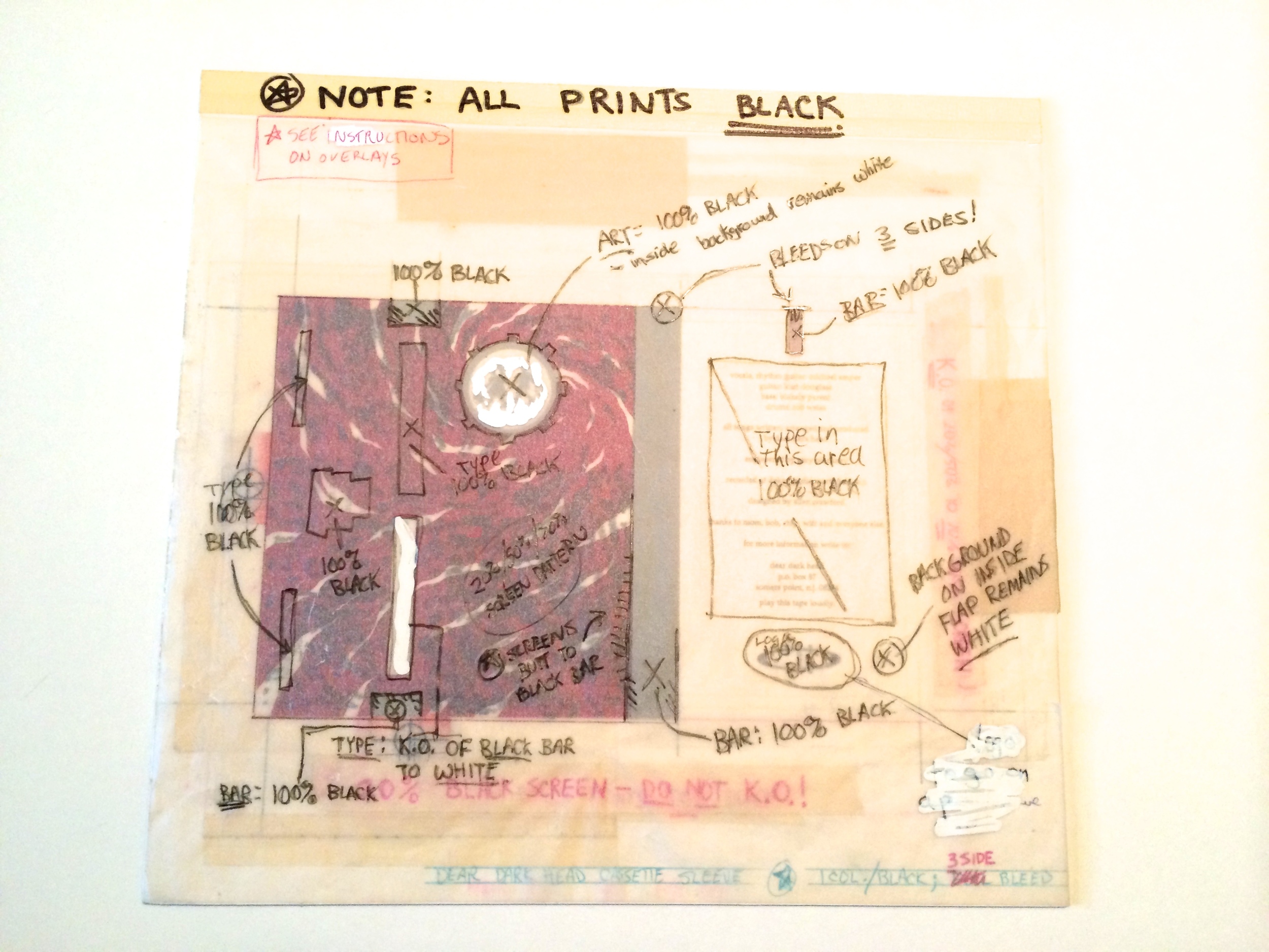
The early 90's was the beginning of the transition between traditional and digital production in the design industry (which in South Jersey meant the printing industry). Type would be printed out of a laser printer at an enlarged size, shot at a reduced size on a photostat, and then pasted onto a mechanical with wax. Spiral Down and Vibrate and Melt Away Too Soon were designed this way, which required guesswork informed by a working knowledge of how specs would play out once onpress, such as how various tints of gray would look together, or if the 20% ghosting effect of an octopus tentacle engraving over a photograph would dominate the small album title. It could be nerve-wracking at times, but it gave these two projects a kind of excitement, because we were toying with the unknown much of the time.
By the time Ultraviolet was finished, I had a basic understanding of Adobe Illustrator and Photoshop, and how to compose and prepare digital files for press. I went shopping at a shell shop in Ocean City to find unusual shells or dried animals to throw into the flatbed scanner (I once scanned a mummified rat that I had found in the cellar of the old house that served as the agency's offices). I was particularly taken by the forms of some dessicated fish at the shell shop, and some shark egg cases I had collected from the beach. Given the title of the album I wanted to go with a more vibrant color palette. I've always been very particular about establishing a color theme in my work: I usually go with a limited palette, most often three principal colors with a couple minor colors popping up here and there to loosen things up without losing the distinct flavor. I spent a great deal of time fussing over the vibrant colors in the cover image; this was a frustrating learning process, as I barely knew what I was doing much of the time.
I remember my heart racing when I would receive proofs from Discmakers, wondering if the final product met my expectations, or if (ack) I had made any mistakes in my files or specs. I eventually worked as a designer at Discmakers, where I would bang out two entire cd package designs a day. The time constraints sometimes made for a great forcing ground for fresh ideas, and I'm proud of much of the work I produced during my short stay there. But I would often think back longingly at the luxurious time and attention that I lavished on those Deardarkhead CDs. I think of them fondly, as artifacts from my youth; I can still remember those warm summer nights, poring over slides and clip art books. Good times.
-- ALLEN CRAWFORD, PLANKTON ART CO.